

Push Connect Click
Screen-printed Merchandise, 2011
This concept was born when a good friend staying in a hospital sent a photo of an instructional graphic on the equipment next to the bed.
The instructions were designed to be easy to comprehend in an emergency, providing clear guidance to push the parts together, connect them, and listen for a click. We agreed immediately that the instructions had implications far beyond the equipment they were originally intended for.
Source: an instructional graphic on hospital equipment, photographed from a bed.
Method: screen print—the type is the entire design, so the setting has to be right the first time.
Caption: none. The wearer explains it or doesn't.
Companion piece: the album cover, drawn from the same photograph.
- Role
- Art direction & screen-print design
- Target
- Put three words of emergency-equipment instruction onto something a person wears in public, with no explanation attached
- Constraints
- 2011 · self-directed · screen print, so the type does all the work—no image to carry a weak line, and no room for a caption explaining the joke
- Force fielded
- Nick Charney Kaye—art direction and screen-print design
- Time-to-dispatch
- Designed and printed 2011, the same year as the concept
- Result
- A printed run carrying Push. Connect. Click.—the shipped half of a concept whose record is still in the queue
- Principal
- Outright Mental (self-directed)
- same year concept to printed goodsArchival · 2011
- none explanation printed alongside itArchival · 2011
Wearing an instruction
A typographic garment is the hardest kind, because there is nothing to look at except judgment: the words, the setting, the spacing, and whether the thing survives being read by a stranger at conversational distance. Three words is the smallest possible amount of rope, and it means every decision—weight, rhythm, where the periods land—is load-bearing.
What makes these three worth printing is that they arrive already stripped. Emergency-equipment instruction is language engineered for someone who is frightened and in a hurry: no tone, no charm, no second reading. Lift it out of the hospital and it becomes a piece of advice with unreasonable range—assembly, repair, relationships, work, any situation where people push and connect and then fail to wait for the sound that confirms it seated.
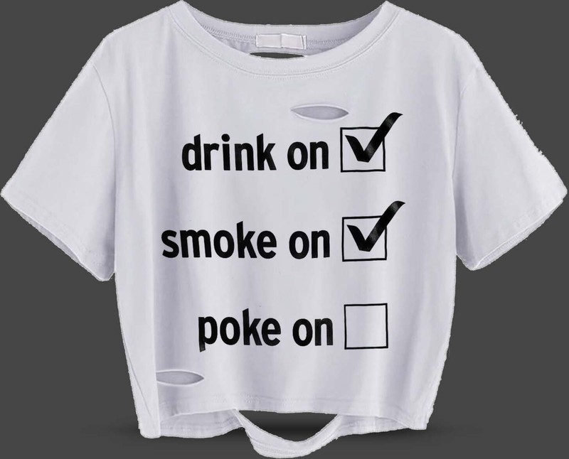
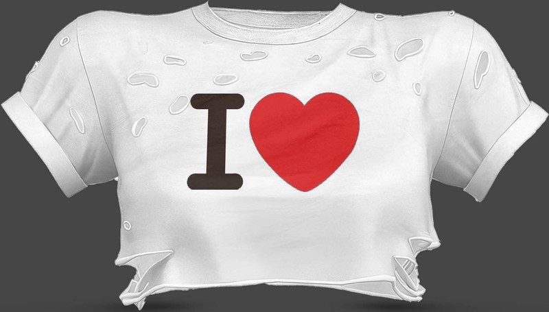
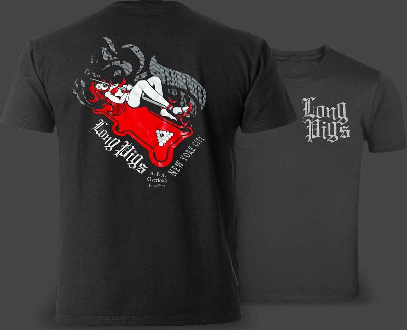
The studio has a persistent weakness for garments that say exactly one true thing: the Long Pigs team shirt, Poke On with its unchecked third box, the I ❤ shirt with the object deleted. This is the one that says a useful thing rather than a funny one.
Acceptance is not passivity—it means acting clearly, without illusion, says the manifesto. That is a longer way of saying push, connect, click: do the thing, seat it properly, and then be quiet long enough to find out whether it actually worked. The studio bought that advice off a machine at a friend’s bedside and has been repeating it since.
Record: a self-directed print run, never a catalog product—proof: [], and no storefront to point at. The goods above are the evidence; the record it was named for is still unfinished, and that page says so too.