

You’re On TV
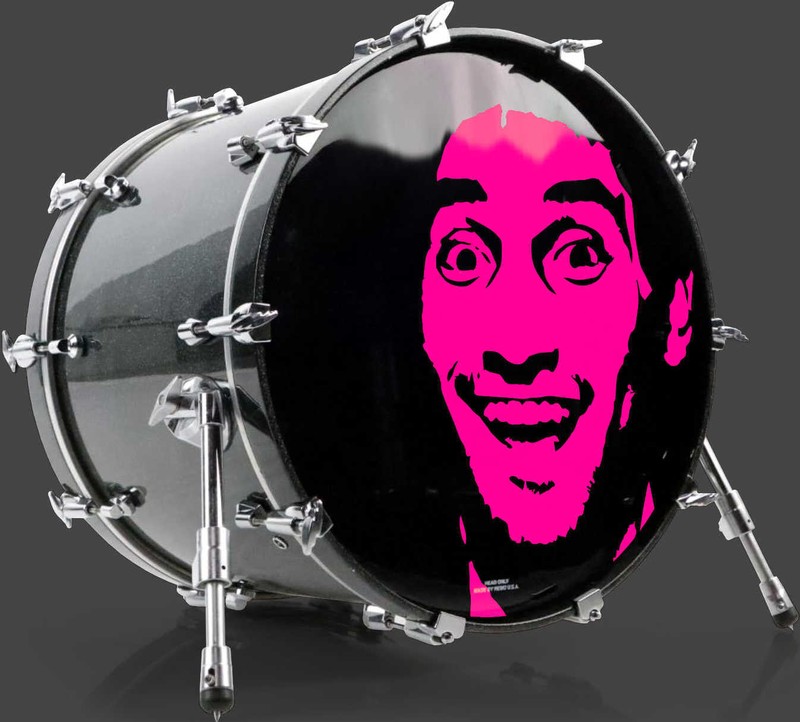
Warning Sign, 2016
There’s a subtle art to putting up a warning sign in New York City. If one comes across too serious, it’s an invitation for trolling. However, a certain level of intensity is required in to get the message across.
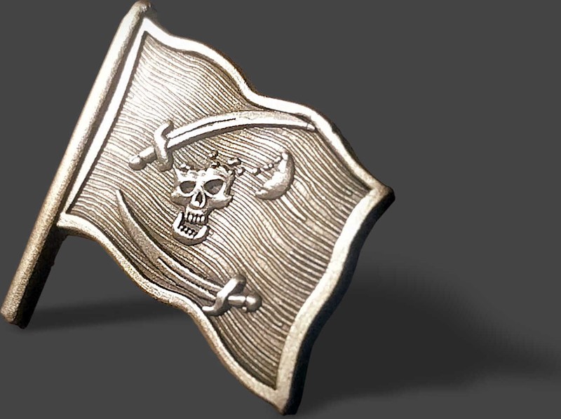
This austere yet cheeky signage was designed to keep trespassers out of our studio.
Audience: New York City, at street level, at speed.
Too serious: reads as a dare. Gets defaced.
Too casual: reads as decoration. Gets ignored.
The target band: austere, with one degree of wink—enough that a reader registers a person wrote it.
Revisions after fabrication: none. That is the design pressure.
- Role
- Art direction & signage design
- Target
- A warning sign that keeps trespassers out of the studio in New York City—credible enough to work, light enough not to invite trolling
- Constraints
- 2016 · New York City, where an over-serious sign is an invitation and an under-serious one is wallpaper · printed on metal, so there is no revision and no A/B test—one tone, chosen once, bolted to a wall
- Force fielded
- Nick Charney Kaye—art direction and signage design
- Time-to-dispatch
- Designed, fabricated and hung in 2016
- Result
- A metal sign that holds the narrow band between austere and cheeky—enough intensity to carry the message, not enough to become a target
- Principal
- Outright Mental (the studio's own door)
- 0 revisions available after fabricationArchival · 2016
- austere, yet cheeky the register it had to hitArchival · 2016
Tone as a security measure
Most warning signage is written by people who have never watched anyone read it. The result is the genre’s default: maximum severity, all capitals, legal boilerplate—a register that in New York City functions as a challenge rather than a deterrent. A sign that tries too hard tells a passer-by there is someone here worth annoying.
The opposite failure is equally reliable. Soften it into a pleasantry and it stops registering as information at all; people file it with the menus and the flyers and walk through.
So the actual design problem is not graphic, it is tonal, and it is unusually unforgiving because the output is metal. There is no iteration cycle on a fabricated sign—the tone gets chosen once, at the drawing stage, and then bolted to a wall for however long the studio occupies the building. You’re On TV is the answer this one landed on: a statement of fact, delivered flat, with just enough dryness that a reader understands a human being is on the other side of the door and is paying attention.
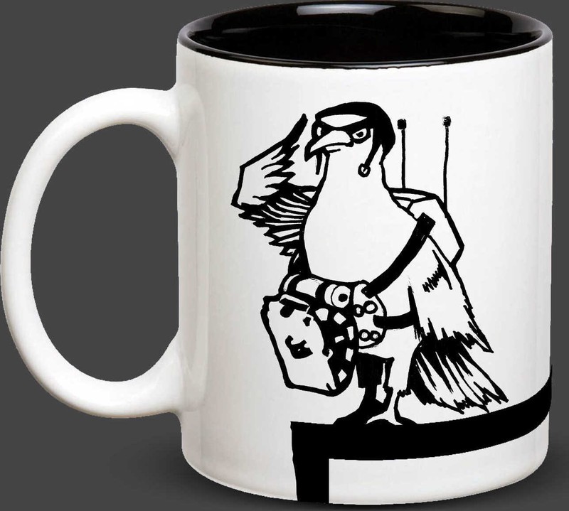
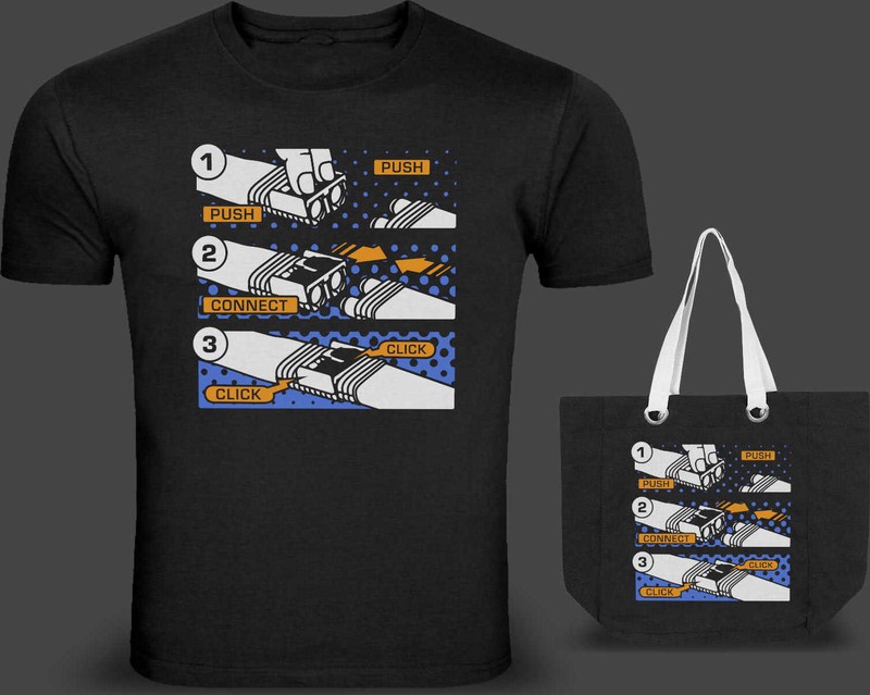
Small objects, exact tone: the Ready for Action mug from six months later, and Push Connect Click, where three words lifted off a machine had to work on a stranger with no caption to help.
Satire with teeth, per the manifesto—deployed here at the smallest scale the studio works at, on a door. The sign challenges a behavior rather than insulting a person, which is also why it works: nobody defaces a sign that has not tried to win.
Record: a self-directed object for the studio’s own premises—proof: [], no product and no link. The sign above is the evidence, and the building it was hung on is somebody else’s now.