

Euphonium Man
Album Cover Art, 2013
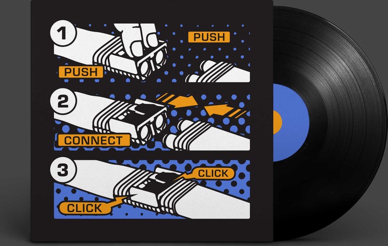
This design was created exclusively for Adam Dotson, the greatest euphonium player in the world.
He’s got it tattooed on his mighty euphonium-gripping arm—but this concept solo album is something we’re still trying to talk him into.
Intended output: an album cover.
Actual output: a tattoo. On the euphonium-gripping arm.
Line discipline: every stroke drawn to survive a needle—no hairlines, no gradients, no detail that blurs when skin moves.
Colorway: whatever the arm can hold. Which is to say: not many.
Album status: pending. Indefinitely. Cheerfully.
- Role
- Art direction & mark design
- Target
- A personal mark for a euphonium player—strong enough to carry an album cover, simple enough to survive being tattooed
- Constraints
- 2013 · two output media with opposite tolerances: print, which forgives detail, and skin, which does not—the drawing had to hold at both, so every line is one a needle can follow
- Force fielded
- Nick Charney Kaye—art direction and mark design; Adam Dotson—the arm, and the horn
- Time-to-dispatch
- Delivered 2013; tattooed shortly after. The album it was drawn for: still under negotiation
- Result
- A mark delivered, adopted, and permanently worn—the highest-commitment client sign-off available in graphic design. The concept solo album remains something the studio is still trying to talk him into
- Principal
- Adam Dotson
- tattooed client sign-off, in ink, permanentArchival · 2013
- unreleased album the cover is waiting onArchival · 2013
Designing for the one medium that cannot be revised
There is a small category of commission where the client’s approval is irreversible, and tattoo work is the whole category. A logo can be refreshed, a cover can be re-issued, a website can be quietly replaced on a Tuesday. Ink is a decision that stays made.
That constraint is good for a drawing. It strips out everything decorative, because decoration is exactly what fails first at the two things a tattoo does over a lifetime: it blurs, and it moves. What survives is silhouette and weight—the same qualities that make a mark legible on an album spine at an inch tall. Design honestly for skin and you have incidentally designed a very good cover.
Which is the running joke of this page. The mark did its hardest job first, permanently, on a person; the easy job—being printed on a record—is the one still outstanding. The studio remains available.
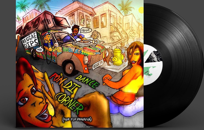
Artifacts for working musicians are a recurring line in this portfolio: Dave Cole’s glow-in-the-dark kick drum head the following year, and the Dance Pon Di Corner cover a decade before it.
The most original work comes from a very small group that is highly skilled, brutally honest, and uninterested in consensus for its own sake, says the manifesto. This one was a group of two, and the brutal honesty is on the page: the album does not exist, we still think it should, and we are not going to pretend the cover art means otherwise.
Record: a personal commission, never published on a release—proof: [], and no link to follow. The artwork above is the evidence; the rest of it is on somebody’s arm.