

Poke On
T-Shirt, 2014
- Role
- Art direction & apparel design
- Target
- Reformat an early-2000s hip-hop benediction as bureaucratic paperwork — a three-item checklist worn as a public status report
- Constraints
- 2014 · self-directed · screen print · pure typography and two checkbox glyphs, so the entire comedy has to be carried by format — and the wearer has to be willing to do the disclosure
- Force fielded
- Nick Charney Kaye — art direction and apparel design
- Time-to-dispatch
- Designed and printed September 2014
- Result
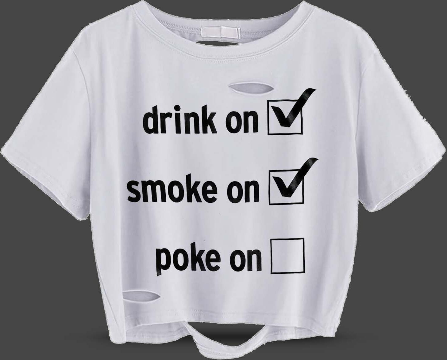
- A black tee reading drink on ☑, smoke on ☑, poke on ☐ — two vices accounted for, one still outstanding. The empty third box is the entire engine
- Principal
- Outright Mental (self-directed)
- 2 boxes checked, of threeArchival · 2014
- the empty one the design's whole engineArchival · 2014
The source text is the early-2000s hip-hop benediction — get yo’ drink on, yo’ smoke on, and go home wit’ sumthin’ to poke on — reformatted as bureaucratic paperwork. The design’s entire engine is that third, empty box: two vices accounted for, one still outstanding, worn as a public status report. The checklist format is doing the comedy; the wearer is doing the disclosure.
Why the checkbox does the work
Reformatting is the whole joke, and it is a more reliable comedic engine than a punchline. The source text is a benediction — spoken, rhythmic, generous, delivered at volume. Set the same three items as a form and every quality of the original inverts: the rhythm becomes a column, the generosity becomes an audit, and a night out becomes something with a completion state. Nothing has been added and nothing has been mocked; the content was simply moved into a container that disagrees with it.
That leaves the third box, which is where the design stops being a joke about paperwork and becomes a disclosure about the wearer. Two items are settled. One is pending, in public, on a garment, in front of whoever is reading it. The checklist format is doing the comedy; the wearer is doing the confession, and the shirt is careful not to do it for them.
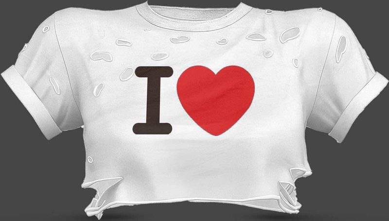
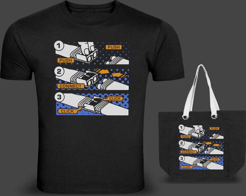
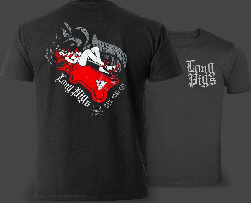
The Long Pigs billiards shirts are this piece’s portfolio ancestors — the studio’s long-running weakness for garments that say exactly one true thing. Push Connect Click is the sincere entry in the same line, and the I ❤ shirt from the same year is the one that deletes its object entirely.
Candor is the studio’s whole flag — the manifesto promises we are sincere, and this shirt is sincerity at laundry-safe scale: an honest accounting of the evening, checkbox by checkbox, with the humility to leave the last one blank. Presence over avoidance includes admitting where the night stands.
Record: a self-directed shirt, never a catalog product — proof: [], and nothing to click through to. The garment above is the evidence; the third box is still open.