

Charney Kaye Inc.
Logo & Business Card, 2017
- Role
- Identity design
- Target
- An identity for the operator's own consulting practice — one object that shows both the mathematics and the gesture, rather than hiding the scaffolding and selling a swoosh
- Constraints
- 2017 · self-directed · a business card, which is the smallest brand surface that exists — two sides, three colors, and no room for a concept that needs explaining · the construction lines had to stay visible without turning the card into a diagram
- Force fielded
- Nick Charney Kaye — identity design, for himself
- Time-to-dispatch
- Designed November 2017; never produced. The system it established was built and printed nine years later
- Result
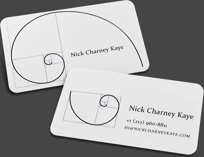
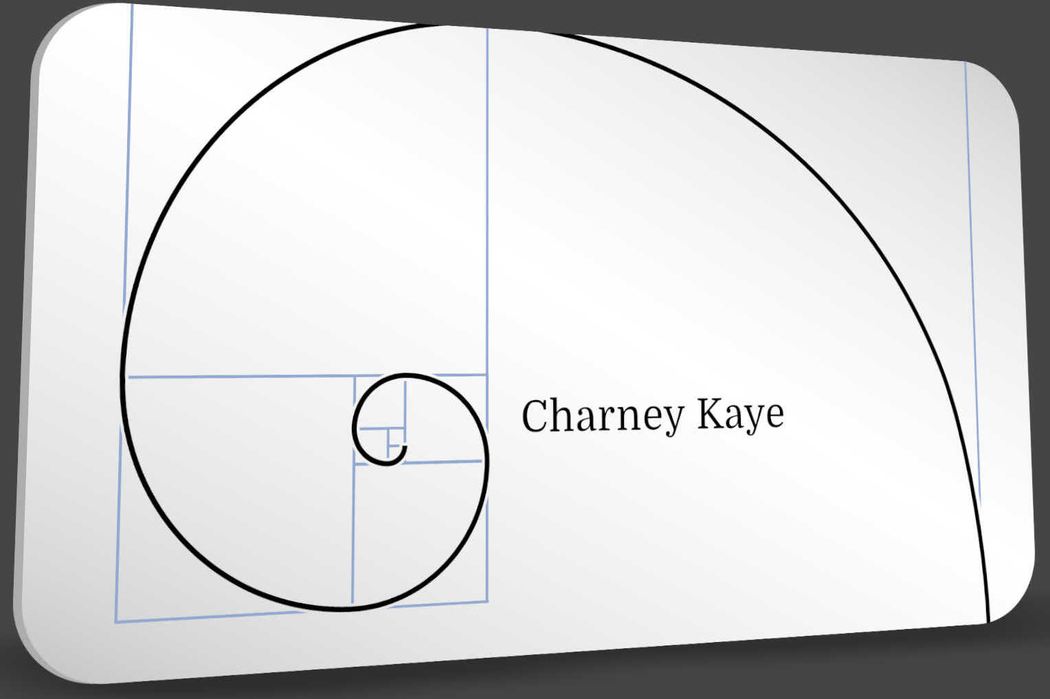
- A golden spiral inked over its own Fibonacci construction rectangles, name set in a classical serif at the eye of the curve. The card was never run — but the system survived intact and is the 2026 card and the operator's website today
- Principal
- Outright Mental (self-directed — the operator's own practice)
- Concept, 2017 studio archive · designed, never producedArchival · 2017
- 9 years from this concept to the printed cardSource ›
An identity concept for the operator’s own consulting practice, drawn in 2017 and never sent to press. It is on this page anyway, because the design it proposed is the one in use today — nine years later, on a card that actually got printed.
The mark is a golden spiral drawn with its construction left visible: the Fibonacci rectangles laid down in pale blueprint blue, the curve inked in black on top of them, and the name set small in a classical serif where the spiral tightens to its eye.
Construction: the Fibonacci rectangles left in, in pale blue — the working file, printed on purpose.
Type: a classical serif, set small, seated at the eye of the curve where the geometry is tightest.
Palette: black ink, blueprint blue, white stock. Three colors, one of which is paper.
Status: designed, never produced.
Descendant: the 2026 card — same idea, same three colors, finally on press.
Showing the scaffolding
Nearly every identity ever made hides its own construction. The grid gets drawn, the proportions get resolved, and then the guides are switched off and the client is handed the finished curve as though it arrived that way. It is a small dishonesty and it is so universal that nobody registers it as one.
This card refuses it. The blue rectangles are not a presentation layer explaining the logo — they are the logo, printed alongside the curve they generate. What it says about the practice is exactly what the practice sells: the answer and the derivation, R&D and implementation, the math and the gesture, from typography down to C++. A person who wants only the swoosh is being told, politely, at the first handshake, that this is not that service.
Why a concept is in the portfolio
Because it was right, and because it took nine years to get printed, and both of those facts are worth publishing. The studio works in sequence, one project at a time, which means good ideas queue — sometimes for most of a decade. When the operator’s identity finally came up for real, in 2026, the answer had already been drawn in 2017 and did not need re-deriving: the card and the website are this concept, produced.
The identity it replaced is also on the record: the NCK monogram, three interlocked letterforms from 2006 — a closed shape from a designer proving his initials could hold, succeeded by an open one from an operator showing his working.
Everything is temporary, including names, says the manifesto — and the studio keeps the receipts of becoming rather than hiding the earlier selves. A concept that sat unproduced for nine years and then turned out to be the answer is the least flattering and most useful kind of portfolio entry: proof that the work was right before it was convenient.
Record: a concept, and the page says so — status: concept, proof: [], never printed and never in circulation. The render above is the whole artifact. What it became is clickable.