

GumSpots
Logo & Product Design, 2006
- Role
- Brand identity & product UI
- Target
- An identity for a pre-iPhone mobile venture, plus the interface for its consumer product jumpWORD
- Constraints
- 2006 · “mobile” still meant SMS and keywords · a venture whose core idea — recognizing a square of sidewalk by the constellation of gum on it — had to be made legible in one mark
- Force fielded
- Nick Charney Kaye — brand identity and product design
- Time-to-dispatch
- Delivered 2006; O'Reilly Radar covered the product that October
- Result
- Identity and product UI delivered. The venture is gone, the domain is gone, and the O'Reilly link is dead — the design is the only surviving evidence that any of it existed
- Principal
- GumSpots (New York)
- “JumpWord: a Mobile Tool Kit” covered by O'Reilly Radar, Oct 2006Archival · 2006
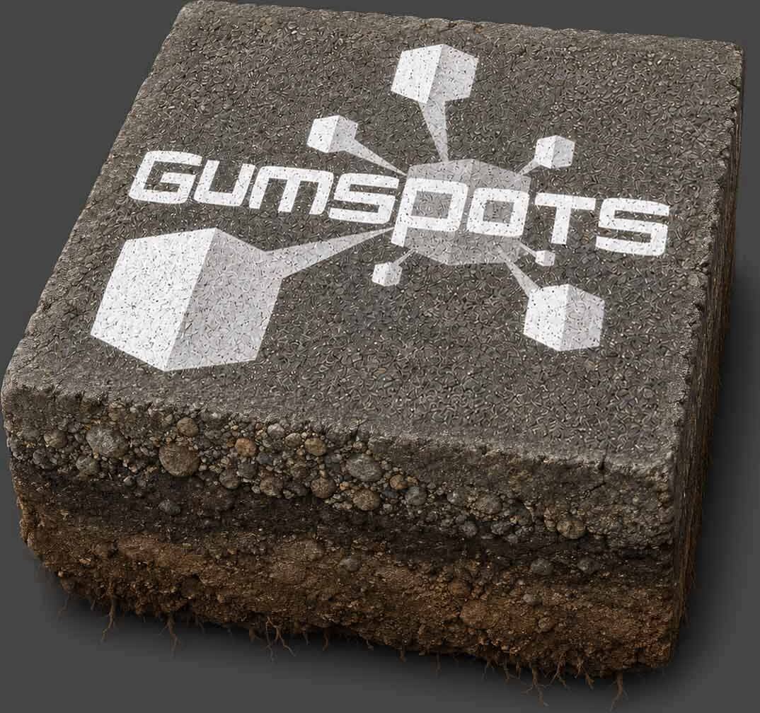
- the logo of the company that survivesArchival · 2006
Gumspots scanned the constellation of wads of gum on any given square of New York City concrete to recognize it. Yeah, you heard that right.
Before the iPhone existed, “mobile” meant SMS, keywords, and nerve. GumSpots was a New York venture from that window — and this is its identity, presented as the spec sheet it never got.
Field: black. The mark supplies its own light.
Reads as: infrastructure. The platform under the product.
The record
O’Reilly Radar covered it in October 2006 as “JumpWord: a Mobile Tool Kit” — real coverage from the publication that named Web 2.0, for a mobile toolkit a year before the iPhone reset the meaning of the word. Then the wave came, and GumSpots joined the honorable roster of pre-iPhone mobile ventures that saw the destination before the vehicle existed. The domain is gone; the O’Reilly link is dead; the design survives.
The same years’ other interactive commissions survived better and are worth reading beside it: the David Blaine site, which still gets memorialized by its own client, and Running Heavy, whose film was never released and whose website outlived it by fifteen years.
The manifesto asks for willingness to fail publicly. This is what that looks like at internet scale: a company that has vanished so thoroughly the only proof it existed is craft. The logo still explains the business in one glance — which is the whole job of a logo, whether or not the business survives to need it.
Record: nothing left to click. The domain is gone and the O’Reilly Radar piece that covered jumpWORD in October 2006 is a dead link — so this page claims no verifiable outcome, and proof: [] says so. The artwork above is the whole surviving estate of a New York venture that saw the destination before the vehicle existed.