

XJ music Brand
Identity & Web Presentation, 2020
The complete brand identity for XJ music—logo, typography, color system, messaging, and the xjmusic.com website. A visual and verbal system designed to make a technically deep music engine feel culturally legible and artist-first.
- Role
- Brand identity & web
- Target
- Make a technically deep music engine culturally legible and artist-first—logo, typography, color, messaging and the website, as one system
- Constraints
- 2020 · a specific translation problem: the audience has to feel “human music” before it can understand “adaptive system” · composers treated as the primary user while technical credibility is maintained for developers · one identity that has to hold across digital, print and merchandise
- Force fielded
- Nick Charney Kaye—brand identity, messaging and web
- Time-to-dispatch
- Delivered 2020; xjmusic.com live and carrying the identity since
- Result
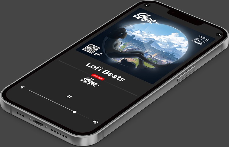
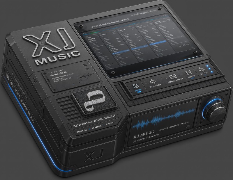
- A complete identity—wordmark drawn as hand-placed vector paths, logo inspired by the original Compact Disc mark, typography, color and capabilities-first messaging—plus the website it lives on. The system went on to carry the merchandise line, the podcast, and the Drops release framework
- Principal
- Outright Mental—XJ music (original IP)
What we did
Created the brand from scratch: designed the logo (inspired by the original Compact Disc mark—a deliberate nod to a time when technology was portrayed with humanist sensibility), established typography and color, wrote messaging pillars, and designed and built the website. The identity system translates across digital, print, and merchandise.
Logo construction
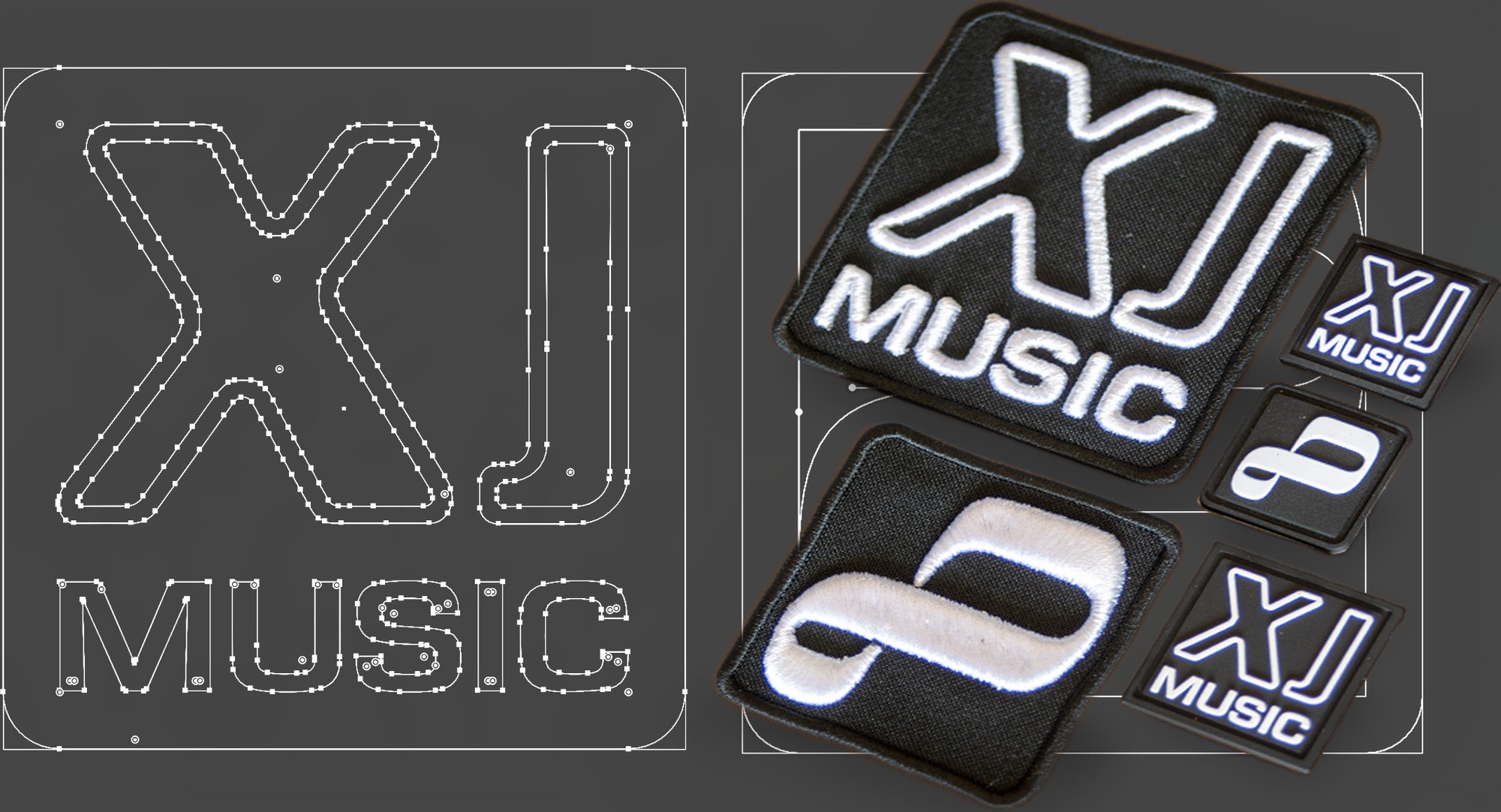
The XJ music wordmark drawn as vector paths—every anchor point placed by hand and laid out on the artboard, like a screen-print film.

Proof
- Website: xjmusic.com—capabilities, documentation, and direct links to technical evidence
- Logo system: Wordmark, icon, and lockup variants designed for digital and print production
- Messaging: Capabilities-first framing (continuous flow, aleatory tools, seamless integration) backed by proofs (open-source repos, documentation, patent reference)
The branding solves a specific translation problem: the audience must feel “human music” before they understand “adaptive system.” The identity treats composers as primary users while maintaining technical credibility.
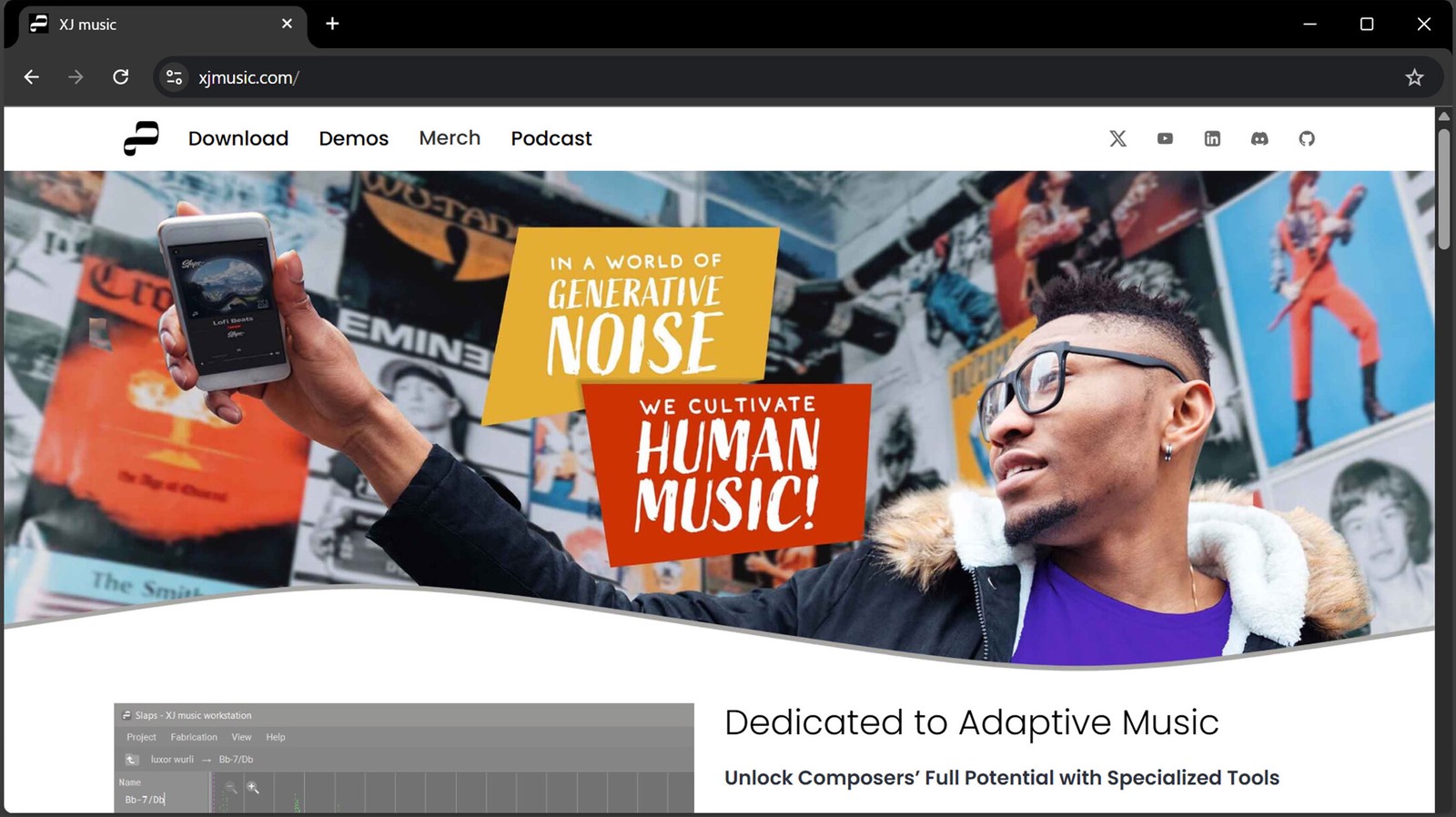
Design System
Clear iconography, strong contrast, and a consistent voice across all channels—website, podcast, social, and print. Every surface links back to the same core story: a system for composing generative music, built for artists and developers.
A real person made this—on purpose, per the manifesto, which is an odd-sounding promise for an algorithmic music system and is exactly why the identity exists. The logo’s nod to the original Compact Disc mark is the argument in one gesture: a time when technology was portrayed with humanist sensibility, borrowed deliberately, because the audience has to feel human music before it can hear adaptive system.
Proof: xjmusic.com—the identity, live since 2020 · the same system under production stress on the merchandise line and across the Drops release framework.