

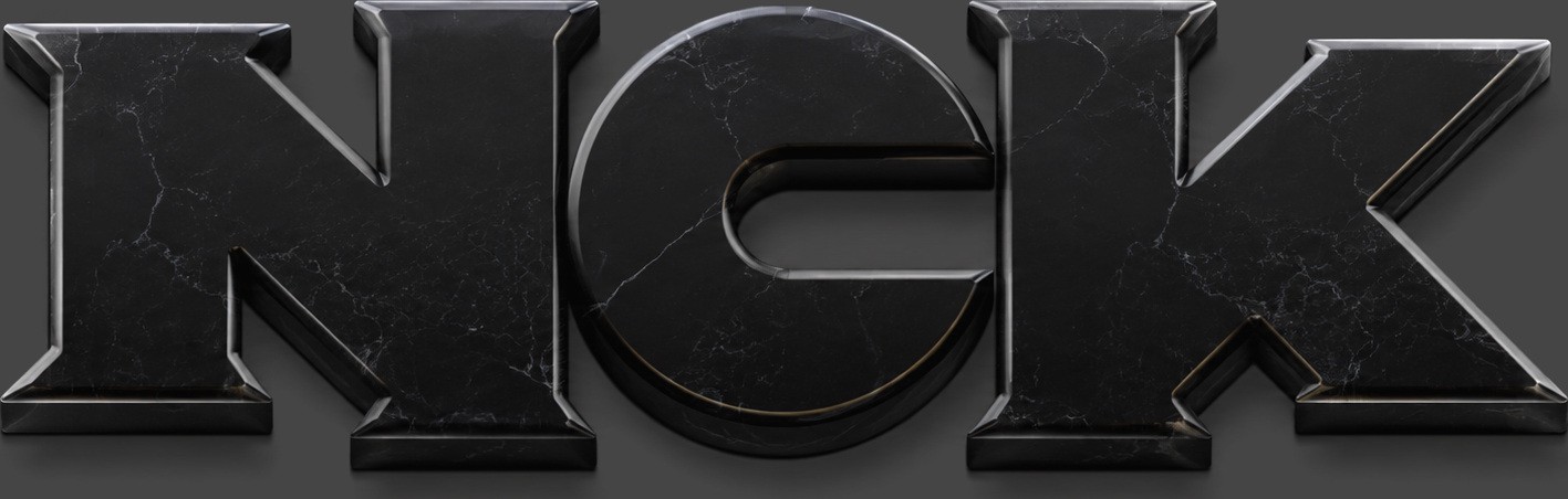
NCK
Personal Monogram, 2006
- Role
- Identity design
- Relationship
- The studio's first mark; in service from 2006 until the Outright Mental stencil replaced it
- Target
- A mark for the operator's own practice — three initials that read as one object at any size
- Constraints
- 2006 · self-directed · monogram discipline: no ornament, no color system, nothing to hide behind but the letterforms themselves
- Force fielded
- Nick Charney Kaye — identity design, for himself
- Time-to-dispatch
- Drawn January 2006; carried the practice for years, and was still signing published work as late as the 2013 “Fooled Us” illustration
- Result
- The NCK monogram — three interlocked black letterforms, notched at sharp angles, the K's leg kicked long — retired when the practice became Outright Mental, and kept on the record rather than quietly deleted
- Principal
- Outright Mental (self-directed — the operator's own practice)
- NCK, 2006 studio archive · first mark, retiredArchival · 2006
- 2013 last seen signing published workSource ›
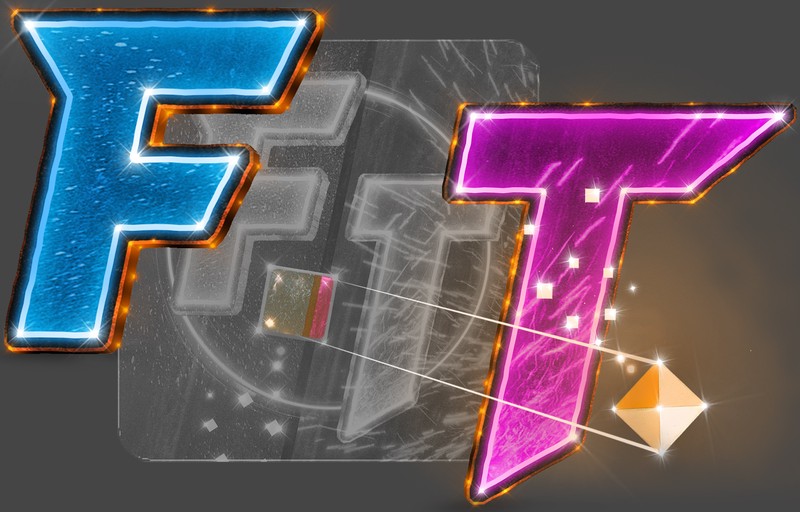
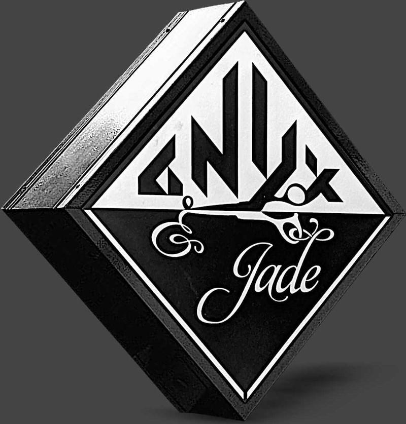
Studios accumulate names the way people do. This is the first one that got a mark: NCK — three heavy black letterforms, tightly interlocked, notched at sharp angles, the K’s leg kicked out long.
Weight: heavy. The counters are the only light in the mark.
Detail: angular notches cut where strokes meet, so the interlock reads even at thumbnail size.
The K's leg: kicked out long — the one gesture in an otherwise closed shape, and the thing that keeps it from being a block.
Palette: black. One color, and it is not negotiable.
Service: 2006 until the Outright Mental stencil took over.

Craft notes
The letterforms lean on interlock rather than ornament: remove any one stroke and the other two stop making sense. That’s a young designer telling you the initials are load-bearing.
It is also the correct answer to the brief a personal monogram actually sets. A logo for a company can afford a concept — a metaphor, a story, a thing it resembles. A monogram has no such room: it is three fixed characters in a fixed order, and the only design decision available is how they hold each other. Interlock is the honest move, and a notch is how you make interlock survive being printed small.
Where it went
The mark did not vanish so much as get outgrown. It was still signing published work seven years later — the 2013 media-criticism illustration “Fooled Us” ran under it, white background, NICKKAYE.COM in the corner — before that drawing was re-signed under the Outright Mental stencil, one image carried across a decade and two identities.
Twenty years on, the operator’s personal identity is a golden spiral with its construction lines left visible. Different answer, same question: show the structure, don’t sell the swoosh.
The manifesto is unsentimental about impermanence — everything is temporary, including names. Keeping the old monogram in the portfolio isn’t nostalgia; it’s the receipts of becoming. You can’t claim the courage to face reality while hiding the earlier selves who practiced it.
Record: a retired mark, self-directed, never licensed — proof: [], because there is nothing to click and this page will not invent something. The drawings above are the evidence, and the fact that the studio still publishes them is the point.