

Fever Tilt Brand
Identity & Logotype, 2026
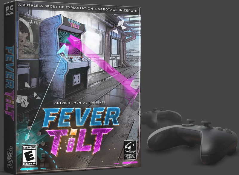
The Fever Tilt identity runs on one idea: the palette is the mechanic.
Two temperatures, one prize
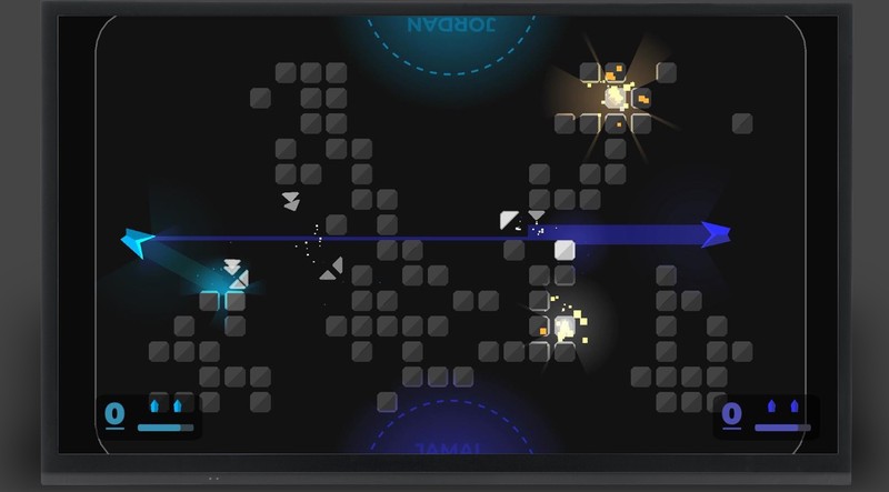
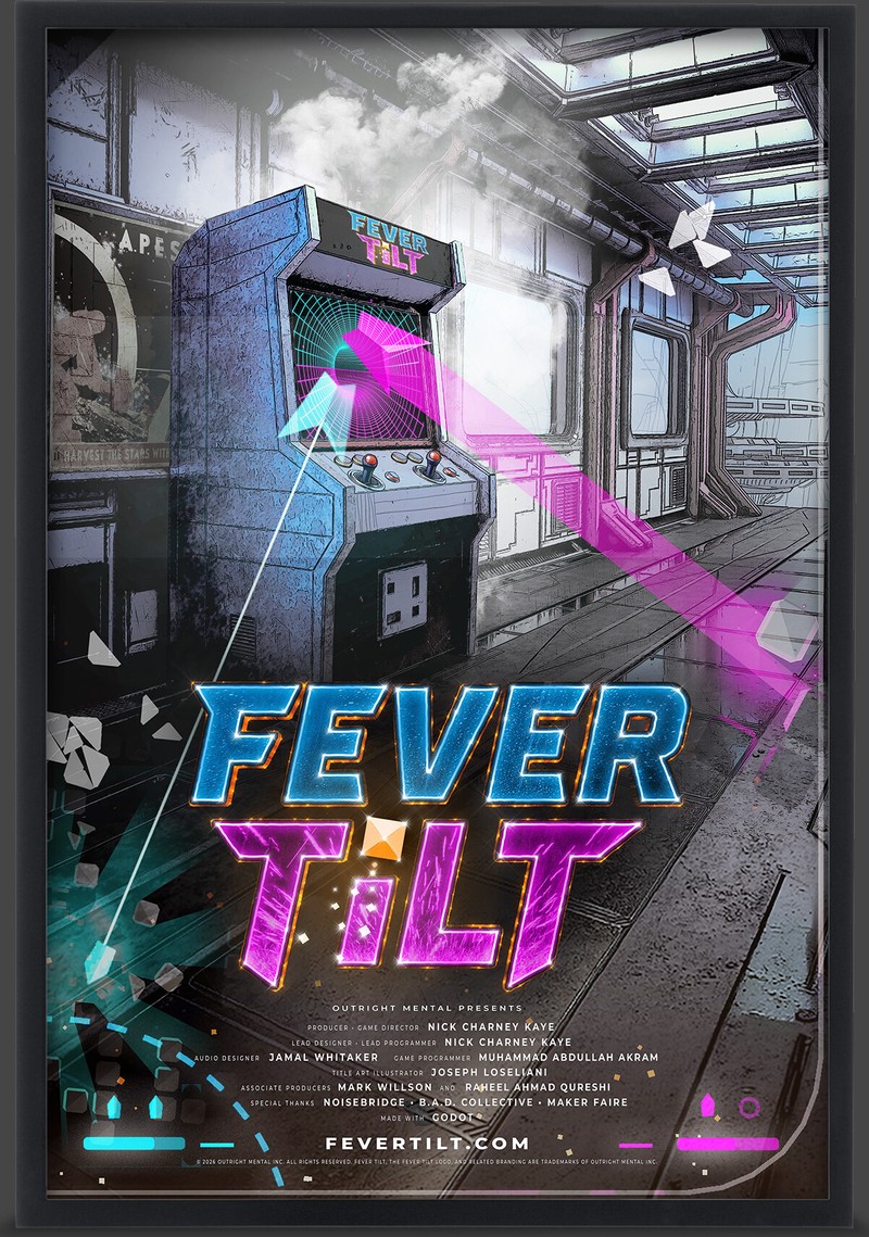
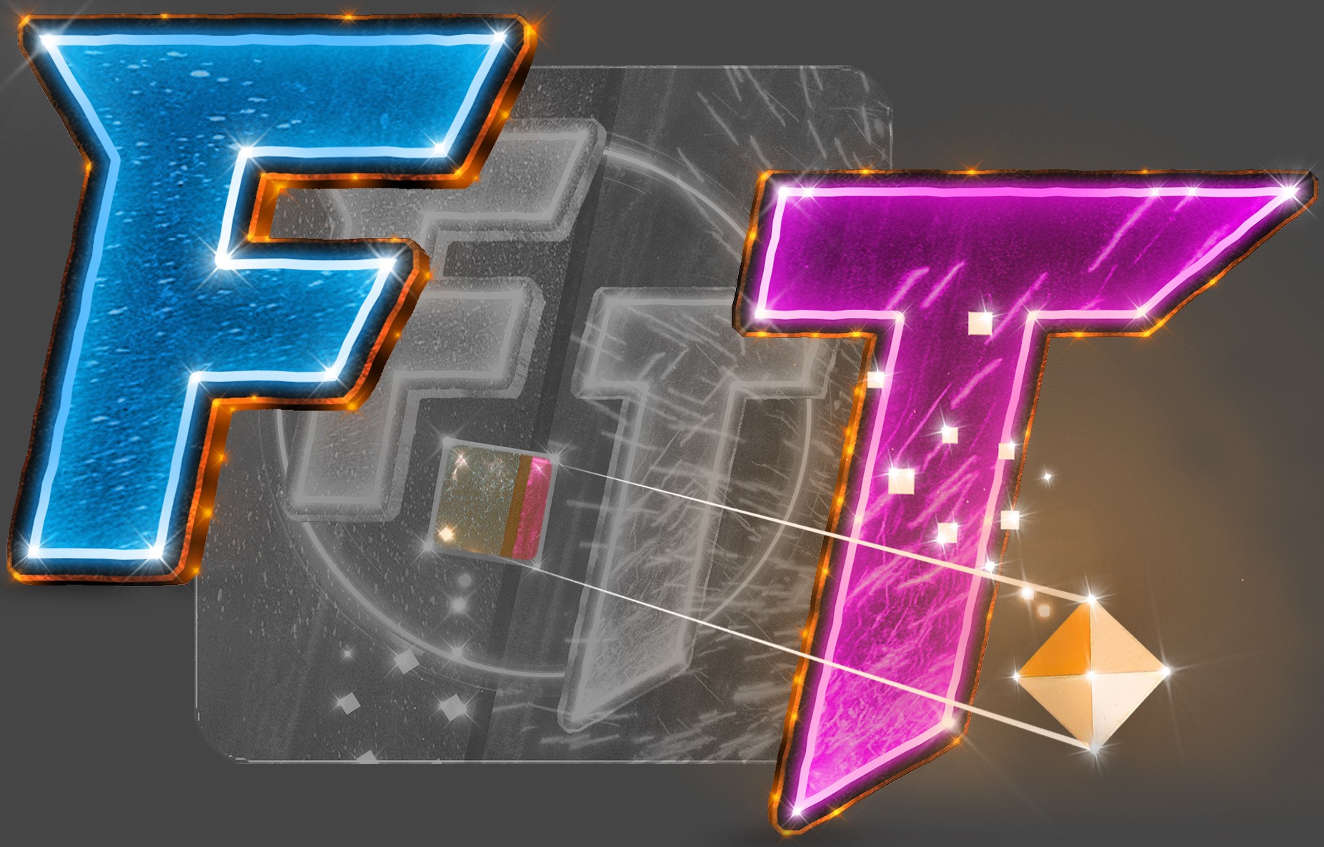
Everything in the arena is a temperature. Blocks are frozen; lasers apply heat; overheat and you’re dead in space for three seconds. The logotype encodes that loop before the tutorial can: FEVER set in glacial, ice-fractured blue — TiLT in hot magenta, crackling like an overdriven coil — and the orange gem dotting the i, the one warm thing both players are fighting over. Read the logo and you’ve read the rules.
The head-to-head is chromatic
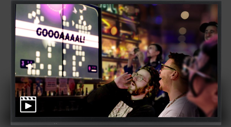
The temperature split doubles as the player split. Cyan on one end, magenta on the other — nameplates, scoreboard, goal zones — so a spectator across the room can track who’s winning from the colors alone. On a real table, where the far player’s name renders upside-down, that legibility is the difference between a crowd and an audience of two.
Everywhere the game goes
One logotype, drawn once, holding at every size and surface: the cabinet marquee, the Steam capsule, the theatrical one-sheet, the trailer end card, and fevertilt.com — where the identity is live now. It ships with its legal teeth in place: Fever Tilt, the Fever Tilt logo, and related branding are trademarks of Outright Mental Inc.