

Nick Charney Kaye
Business Card, 2026
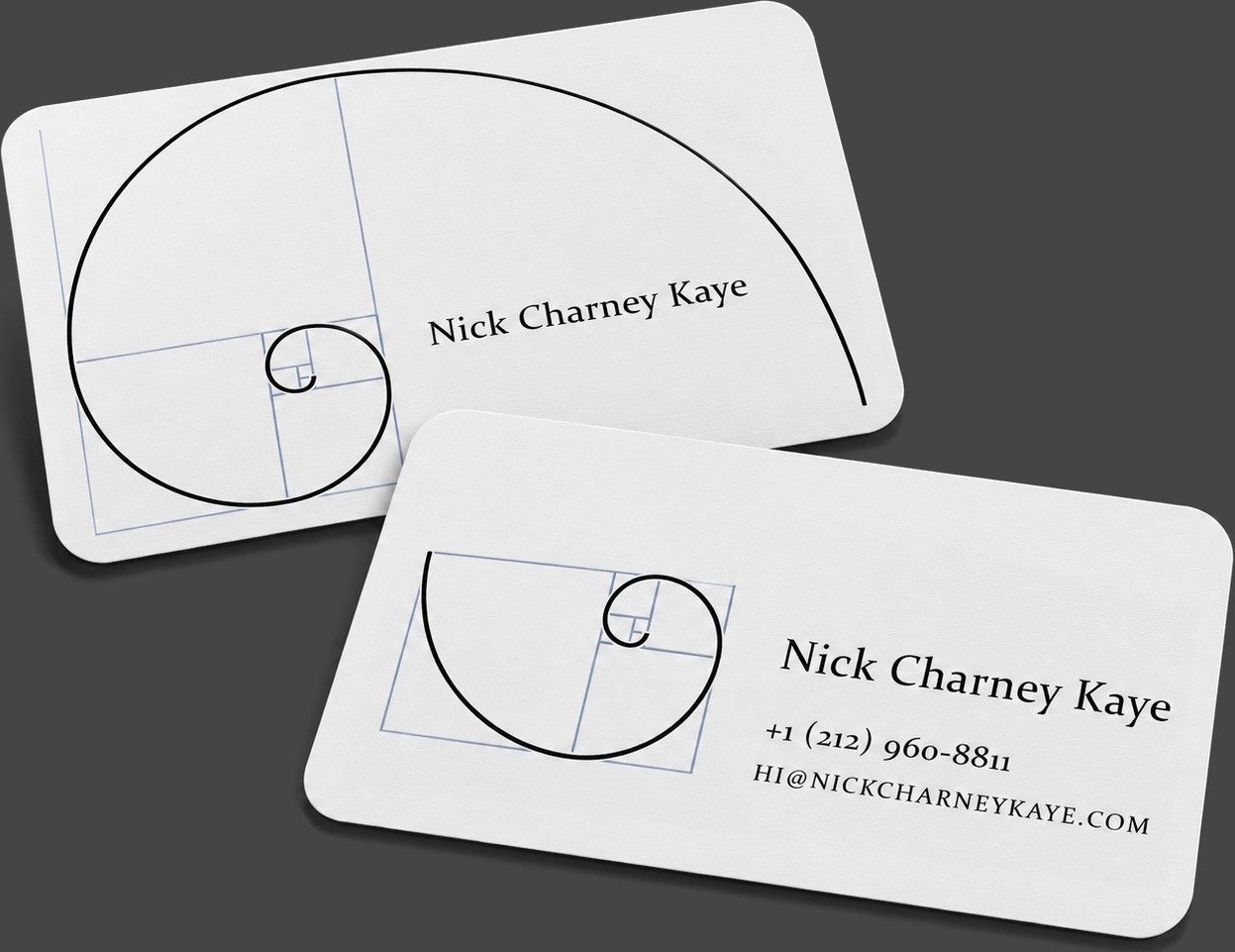
A personal card for the studio’s operator, and a one-object thesis on how he works: the mark is a golden spiral drawn with its construction lines left visible — the Fibonacci rectangles in faint blueprint blue, the curve inked in black over them. Most identities hide the scaffolding and sell you the swoosh. This one shows the math and the gesture, because the whole practice is the two together: R&D and implementation, typography to C++.
Back: the same construction at reference scale, then the facts: name, phone, email. Nothing else earned a line.
Type: a classical serif, letterspaced small caps for the address — engineering drawing meets letterpress manners.
Palette: black ink, blueprint-blue construction, white stock. Three colors, one of which is paper.
One system, two surfaces
The card is half of an identity refresh — the same spiral, serif, and blueprint restraint carry nickcharneykaye.com, so the object you keep from a meeting and the site you visit afterward are recognizably one hand. A business card in 2026 is admittedly a ceremonial object. That’s precisely why it’s worth doing well: ceremony is where craft shows.
Small is not a phase — small is the method, says the manifesto. A card is the smallest brand surface that exists. Get the proportions right there and they hold at every scale after.