

Lonneke Engel
Official Website, 2010
- Role
- Art direction & product strategy
- Target
- A personal site for an international model whose audience spans languages — navigable with no menus, no text navigation, and nothing to translate
- Constraints
- 2010 · bilingual English/Nederlands · the client's own brief was an empty white screen with a menu bar across the top · every navigation affordance had to be a painted object rather than a word
- Force fielded
- Nick Charney Kaye — art direction and product strategy
- Time-to-dispatch
- Delivered April 2010
- Result
- lonneke.com relaunched as a radically minimal white field navigated by a single dock of photorealistic icons, with a draggable pile of test-shoot Polaroids and a browsable wall of her covers, 1995–2010. The domain remains hers today
- Principal
- Lonneke Engel
- 8 painted icons navigation without a single wordArchival · 2010
- 1995–2010 covers scanned and bound into the siteArchival · 2010
- lonneke.com domain still the client'sSource ›
Lonneke Engel — the Dutch Top Model, longtime face of Ralph Lauren, founder of Organice Your Life — opened her MacBook, pointed at an empty white screen with the menu bar across the top, and asked:
“Can my website be like this?”
Yes. lonneke.com became a radically minimal white field navigated by a single dock of photorealistic icons — no menus, no text navigation, nothing to translate. Her audience spanned languages (the site ran bilingual English/Nederlands), so the brand had to transcend language entirely, conjuring a rhythm of icons instead.
The dock, as a legend
Each icon was painted to read at a glance, like the objects on her actual desk:
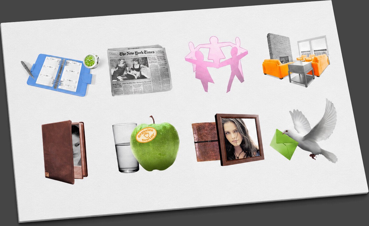
- The planner — her agenda and appearances.
- The newspaper — press and news.
- The paper-doll chain — relationships, the people around her.
- The living room — home.
- The leather portfolio — the modeling book.
- The apple and water glass — Organice Your Life, her wellness philosophy.
- The framed portrait — about Lonneke.
- The dove with the green envelope — write to her.
Two rooms worth lingering in
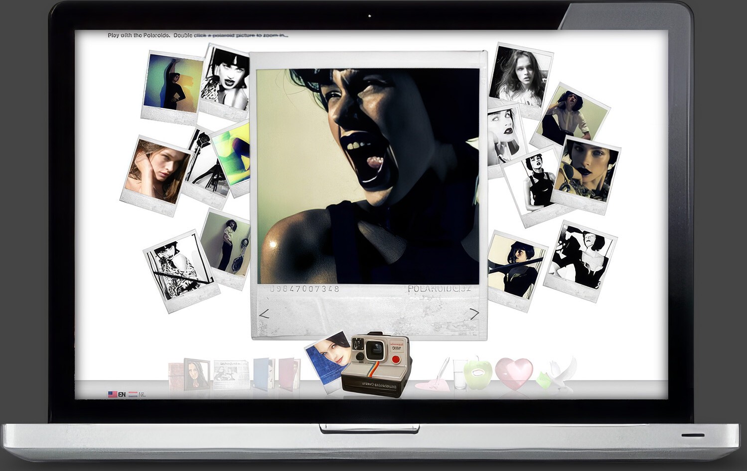
The Polaroids. A scattered, draggable pile of real test-shoot Polaroids — pick them up, throw them around, double-click to zoom — while a OneStep camera at the bottom of the screen keeps printing more. Play as navigation.
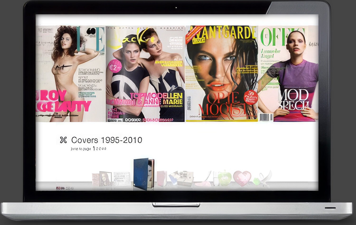
The Magazine Book. Her covers, 1995–2010 — which existed physically as four-foot-high towers of magazines stacked in her loft — scanned and bound into a browsable wall: ELLE, L’Officiel, Avantgarde, the Dutch Jackie.
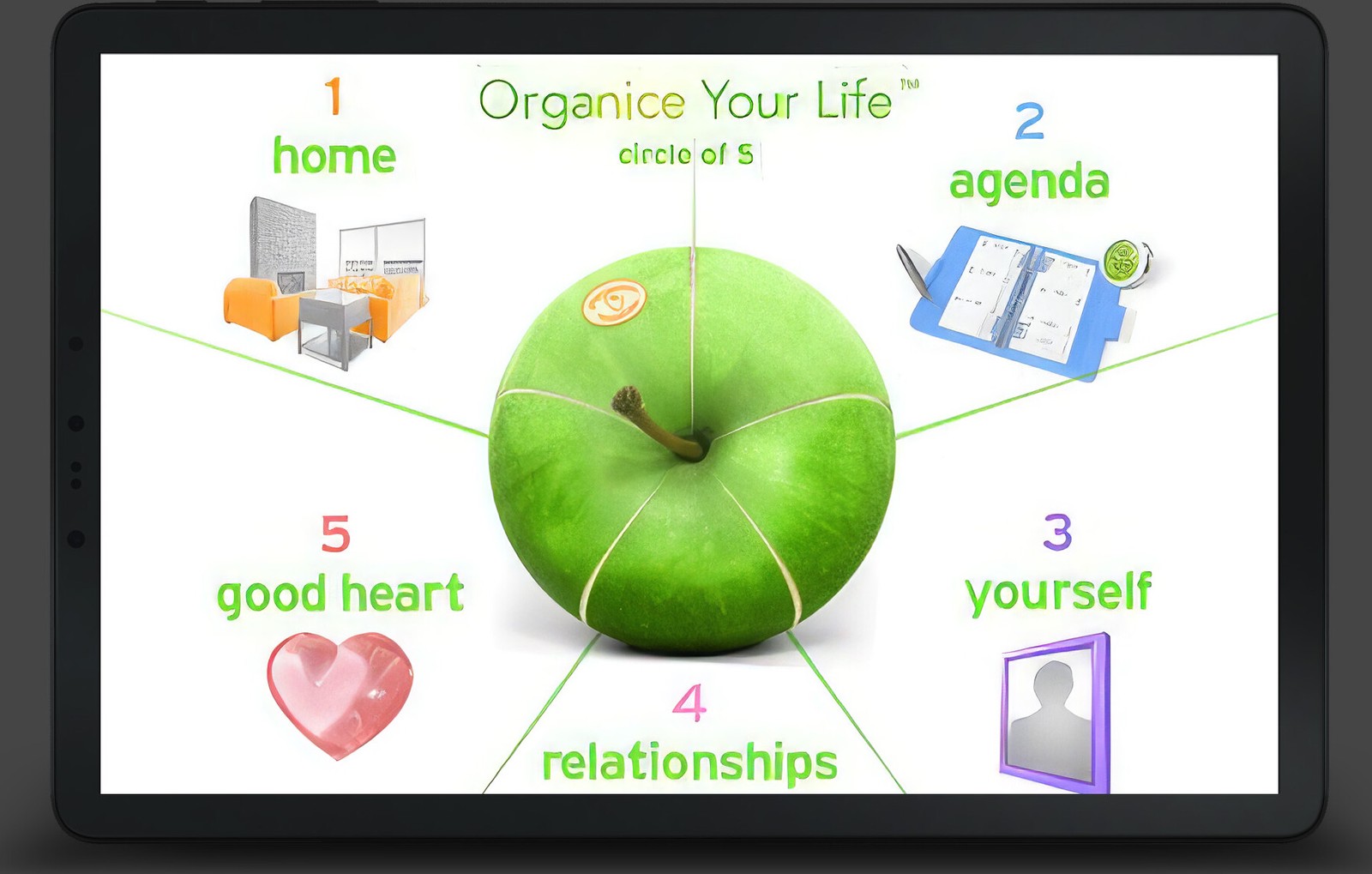
For Organice Your Life, the “Circle of 5” page mapped her philosophy as spokes around a green apple: home, agenda, yourself, relationships, a good heart.
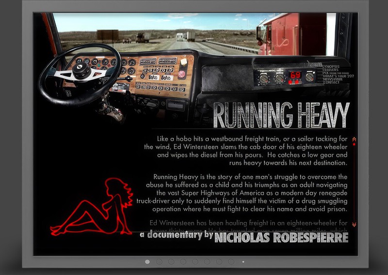
Read it against the other two interactive commissions on this shelf: Running Heavy, which made the interface a place you sit inside, and the David Blaine site, which made it a deck of cards. Three clients, three metaphors, one question — what object is this website pretending to be?
The manifesto calls for being fully present with one thing at a time — and this design is that principle as an interface. One white room. One dock. One icon at a time. Nothing else asking for your attention.
Proof: lonneke.com remains hers today (now a podcast and activism site). Lonneke founded Organice Your Life in 2008 and became a certified health coach the year after — the apple icon was pointing somewhere real.